Sunday, December 22, 2013

Visual analytics for uncovering complex learning: Part I

All educational research and assessment are based on inference from evidence. Evidence is constructed from learner data. The quality of this construction is, therefore, fundamentally important. Many educational measurements have relied on eliciting, analyzing, and interpreting students' constructed responses to assessment questions. New types of data may engender new opportunities for improving the validity and reliability of educational measurements. In this series of articles, I will show how graph theory can be applied to educational research.

The process of inquiry-based learning with an interactive computer model can be imagined as a trajectory of exploring in the problem space spanned by the user interface of the model. Students use various widgets to control different variables, observe the corresponding emergent behaviors, take some data, and then reason with the data to draw a conclusion. This sounds obvious. But exactly how do we capture, visualize, and analyze this process?

From the point of view of computational science, the learning space is enormous: If we have 10 controls in the user interface and each control has five inputs, there are potentially 100,000 different ways of interacting with the model, assuming that the user interacts with each control once and only once. To be able to tackle a problem of this magnitude, we can use some mathematics. Graph theory is a trick that we are building into our process analytics. The publication of Leonhard Euler's Seven Bridges of Königsberg in 1736 is commonly considered as the birth of graph theory.

Figure 1: A learning graph made of two subgraphs representing two ideas.
In graph theory, a graph is a collection of vertices connected by edges: G = (V, E). When applied to learning, a vertex represents an indicator that may be related to certain competency of a student, which can be logged by software. An edge represents the transition from one indicator to another. We call a graph that represents a learning process as a learning graph.

A learning graph is always a digraph G = (V, A) -- namely, it always has directed edges or arrows -- because of the temporal nature of learning. Most likely, it is a multigraph that has multiple directed edges between one or more than one pair of vertices (it is sometimes called a multidigraph) because the student often needs multiple transitions between indicators to learn their connections. A learning graph often has loops, edges that connect back to the same vertex, because the student may perform multiple actions related to an indicator consecutively before making a transition. Figure 1 shows a learning graph that includes two sets of indicators, each for an idea.

Figure 2. The adjacency matrix of the graph in Figure 1.
The size of a learning graph is defined as the number of its arrows, denoted by |A(G)|. The size approximately represents the number of actions the student takes during learning. The multiplicity of an arrow is the number of multiple arrows sharing the same vertices. The multiplicity of a graph is the maximum multiplicity of its arrows. The multiplicity represents the most frequent transition between two indicators in a learning process. The degree dG(v) of a vertex v in a graph G is the number of edges incident to v, with loops being counted twice. A vertex of degree 0 is an isolated vertex. A vertex of degree 1 is a leaf. The degree of a vertex represents the times the action related to the corresponding indicator is performed. The maximum degree Δ(G) of a graph G is the largest degree over all vertices; the minimum degree δ(G), the smallest.

The distance dG(u, v) between two vertices u and v in a graph G is the length of a shortest path between them. When u and v are identical, their distance is 0. When u and v are unreachable from each other, their distance is defined to be infinity ∞. The distance between two indicators may reveal how the related constructs are connected in the learning process.

Figure 3. A more crosscutting learning trajectory between two ideas.
Two vertices u and v are called adjacent if an edge exists between them, denoted by u ~ v. The square adjacency matrix is a means of representing which vertices of a graph are adjacent to which other vertices. Figure 2 is the adjacency matrix of the graph in Figure 1, the trace (the sum of all the diagonal elements in the matrix) of which represents the number of loops in the graph. Having known the adjacency matrix, we can apply the spectral graph theory to study the properties of a graph in relationship to the characteristic polynomial, eigenvalues, and eigenvectors of the matrix (because the adjacency matrix of a learning graph is a digraph, the eigenvalues are often complex numbers). For example, the eigenvalues of the adjacency matrix may be used to reduce the dimensionality of the dataset into clusters.

Figure 4. The adjacency matrix of the graph in Figure 3.
How might learning graphs be useful for analyzing student learning? Figure 3 gives an example that shows a different behavior of exploration between two ideas (such as heat and temperature or pressure and temperature). In this hypothetical case, the student has more transitions between two subgraphs that represent the two ideas and their indicator domains. This pattern can potentially result in better understanding of the connections between the ideas. The adjacency matrix shown in Figure 4 has different block structures than that shown in Figure 2: The blocks A-B and B-A are much sparser in Figure 2 than in Figure 4. The spectra of these two matrices may be quite different and could be used to characterize the knowledge integration process that fosters the linkage between the two ideas.

Go to Part II.

Saturday, December 14, 2013

Season's greetings from Energy2D

I have been so swamped in fund raising these days that I haven't been able to update this blog for more than two months. Since it is the time of the year again, I thought I should just share a holiday video made by Matthew d'Alessio, a professor at California State University Northridge, using our signature software Energy2D.

The simulator currently attracts more than 5,000 unique visitors each month, a number that probably represents a sizable portion of engineering students studying the subject of heat transfer on the planet. Over the past year, I have received a lot of encouraging emails from Energy2D's worldwide users. Some of them even compared it with well-known engineering programs. Franco Landriscina at the University of Trieste has written Energy2D into his recent Springer book "Simulation and Learning: A Model-Centered Approach."

I am truly grateful for these positive reactions. I want to say "Thank You" for all your nice words. There is nothing more rewarding than hearing from you on this fascinating subject of fluid dynamics and heat transfer. Rest assured that the development of this program will resume irrespective of its funding. In 2014, I hope to come up with a better radiation solver, which I have been thinking for quite a long time. It turns out that simulating radiation is much more difficult than simulating convection!

Here is a tutorial video in Spanish made by Gabriel Concha.

Wednesday, October 9, 2013

Molecular modelers won Nobel Prize in Chemistry

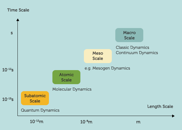
Martin Karplus, Michael Levitt, and Arieh Warshel won the 2013 Nobel Prize For Chemistry today "for the development of multiscale models for complex chemical systems."

The Royal Swedish Academy of Sciences said the three scientists' research in the 1970s has helped scientists develop programs that unveil chemical processes. "The work of Karplus, Levitt and Warshel is ground-breaking in that they managed to make Newton's classical physics work side-by-side with the fundamentally different quantum physics," the academy said. "Previously, chemists had to choose to use either/or." Together with a few earlier Nobel Prizes in quantum chemistry, this award consecrates the field of computational chemistry.

Incidentally, Martin Karplus is my postdoc co-adviser Georgios Archontis's thesis adviser at Harvard. Georgios is one of the earlier contributors to CHARMM, a widely-used package of computational chemistry. CHARMM was the computational tool that I used when working with Georgios almost 15 years ago. In collaboration with Martin, Georgios and I were studying glycogen phosphorylase inhibitors based on a free energy perturbation analysis using CHARMM. In another project with Spyros Skourtis, I wrote a multi-scale simulation program that couples molecular dynamics and quantum dynamics to study electron transfer in proteins and DNA molecules (i.e., use Newton's Equation of Motion to predict the trajectories of atoms, construct the Hamiltonian time series, and solve the time-dependent Schrodinger equation using the Hamiltonian series as the input).

We are thrilled by this news because much of the computational kernels of our Molecular Workbench software was actually inspired by CHARMM. The Molecular Workbench also advocates a multiscale philosophy and pedagogical approach, but for linking concepts at different scales with simulations in order to help students connect the dots and build more unified pictures about science (see the image above).

We are glad to be part of the "Karplus genealogy tree," as Georgios put it when replying my congratulatory email. We hope that through our grassroots work in education, the power of molecular simulation from the top of the scientific research pyramid will enlighten millions of students and ignite their interest and curiosity in science.

Saturday, October 5, 2013

Computational process analytics: Compute-intensive educational research and assessment

Trajectories of building movement (good)
Computational process analytics (CPA) differs from traditional research and assessment methods in that it is not only data-intensive, but also compute-intensive. A unique feature of CPA is that it automatically analyzes the performance of student artifacts (including all the intermediate products) using the same set of science-based computational engines that students used to solve problems. The computational engines encompass every single details in the artifacts and their complex interactions that are highly relevant to the nature of the problems students solved. They also recreate the scenarios and contexts of student learning (e.g., the calculated results in such a post-processing analysis are exactly the same as those presented as feedback to students while they were solving the problems). As such, the computational engines provide holistic, high-fidelity assessments of students' work that no human evaluator can ever beat -- while no one can track numerous variables students might have created in long and deep learning processes in a short evaluation time, a computer program can easily do the job. Utilizing disciplinarily intelligent computational engines to do performance assessment was a major breakthrough in CPA as this approach really has the potential to revolutionize computer-based assessment.

No building movement (bad)
To give an example, this weekend I am busy running all the analysis jobs on my computer to process 1 GB of data logged by our Energy3D CAD software. I am trying to reconstruct and visualize the learning and design trajectories of all the students, projected onto many
different axes and planes of the state space. To do that, an estimate of 30-40 hours of CPU time on my Lenovo X230 tablet, which is a pretty fast machine, is needed. Each step loads up a sequence of artifacts, runs a solar simulation for each artifact, and analyzes the results (since I have automated the entire process, this is actually not as bad as it sounds). Our assumption is that the time evolution of the performance of these artifacts would approximately reflect the time evolution of the performance of their designers. We should be able to tell how well a student was learning by examining if the performance of her artifacts shows a systematic trend of improvement, or is just random. This is way better than the performance assessment based on just looking at students' final products.

After all the intermediate performance data were retrieved through post-processing the artifacts, we can then analyze them using our Process Analyzer -- a visual mining tool being developed to show the analysis results in various visualizations (it is our hope that the Process Analyzer will eventually become a powerful assessment assistant to teachers as it would free teachers from having to deal with an enormous amount of raw data or complicated data mining algorithms). For example, the two images in this post show that one student went through a lot of optimization in her design and the other did not (there is no trajectory in the second image).