Wednesday, December 31, 2014

Happy New Year from Energy2D

In the year 2014, Energy2D has incorporated a radiation simulation engine and a particle simulation engine, expanding its modeling capacity and making it a truly multiphysics simulation package. To celebrate the New Year, I made some simulations that demonstrate these multiphysics features using objects shaped after the numbers of 2015.

These simulations feature the fluid dynamics engine, the heat conduction engine, the thermal radiation engine, and the particle dynamics engine. If you are curious enough, you can click this link to run the simulations.


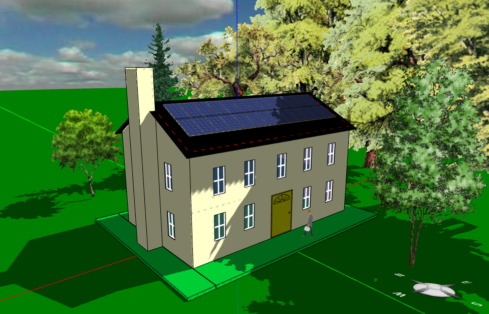
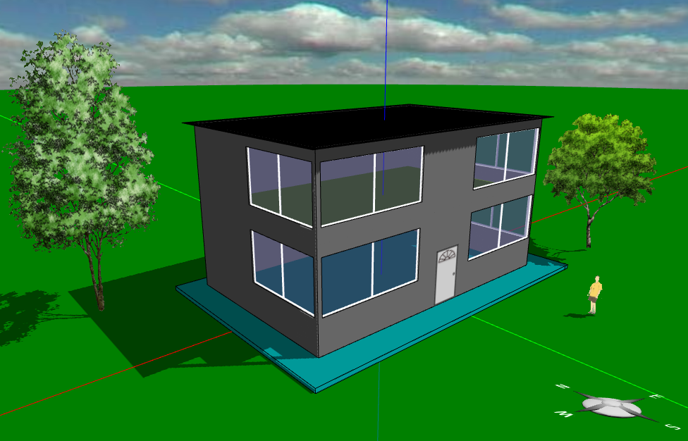
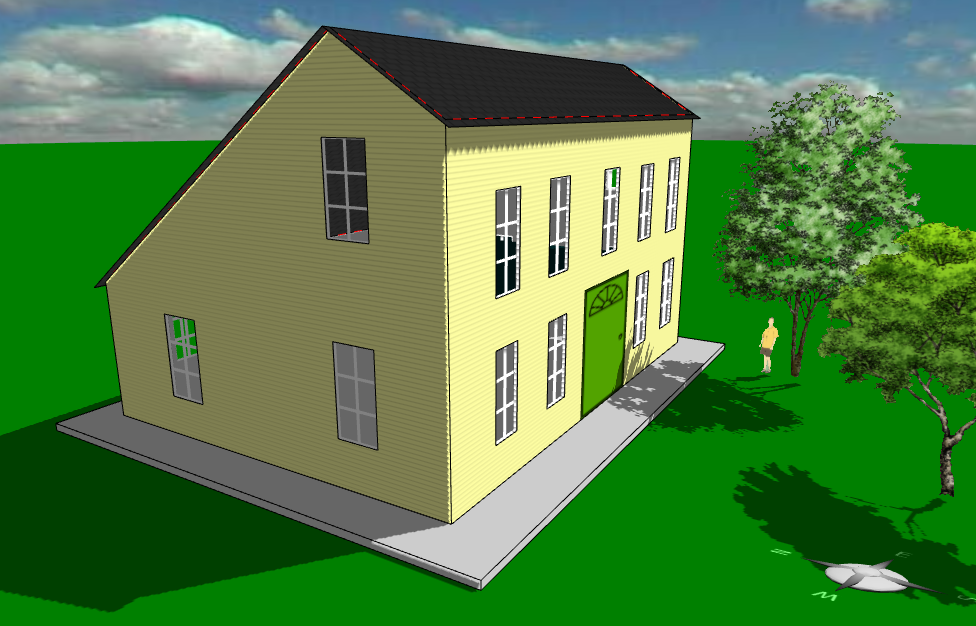
These shapes were drawn using Energy2D's polygon and ring tools, which allow users to create a wide variety of arbitrary 2D shapes. Many users probably do not know how versatile the polygon tool actually is (the original triangle icon on the tool bar probably misleads some to think it is only good for drawing triangles -- so I changed it to look like a cross-section of an I-beam). The polygon tool allows one to easily draw a polygon with maximally 256 control points for adjusting its shape later. One can draw an approximate shape and then drag these control points to get it to the exact shape. To modify a shape even further, one can also insert a control point by double-clicking on an existing point. A new point will be added to the adjacent position, which you can then drag around. To delete a control point, just hold down the SHIFT key while double-clicking on it. In addition, a polygon can be rotated, twisted, compressed, or elongated using the corresponding fields in its property window (there is currently no graphical user interface for doing those things, however).

As for the New Year's resolutions, in 2015, the ring shape will be enhanced into a new tool called the shape subtractor, which allows users to subtract a shape from another to make a hollow one.

On the numerical simulation side, we will continue to improve the accuracy of the existing simulation engines by adding an explicit solver as an option for users to overcome some of the problems related to the implicit solvers.

On the multiphysics modeling side, we will try to support multiple fluids, which seems simple at first glance but has turned out to be a very difficult mathematical problem. With the capacity of multiple fluids, we will also be able to add an electromagnetism solver in order to model effects such as electrorheological fluids (fluids whose viscosity changes with respect to an applied electric field).

We wish all Energy2D users a very successful new year!

Sunday, December 21, 2014

The deception of unconditionally stable solvers

Unconditionally stable solvers for time-dependent ordinary or partial differential equations are desirable in game development because they are highly resilient to player actions -- they never "blow up." In the entertainment industry, unconditionally stable solvers for creating visual fluid effects (e.g., flow, smoke, or fire) in games and movies were popularized by Jos Stam's 1999 paper "Stable Fluids."

Figure 1: Heat conduction between two objects.
The reason that a solver explodes is because the error generated in a numerical procedure gets amplified in iteration and grows exponentially. This occurs especially when the differential equation is stiff. A stiff equation often contains one or more terms that change very rapidly in space or time. For example, a sudden change of temperature between two touching objects (Figure 1) creates what is known as a singularity in mathematics (a jump discontinuity, to be more specific). Even if the system described by the equation has many other terms that do not behave like this, one such term is enough to crash the whole solver if it is linked to other terms directly or indirectly. To avoid this breakdown, a very small time step must be used, which often makes the simulation look too slow to be useful for games.

The above problem typically occurs in what is known as the explicit method in the family of the finite-difference methods (FDMs) commonly used to solve time-dependent differential equations. There is a magic bullet for solving this problem. This method is known as the implicit method. The secret is that it introduces numerical diffusion, an unphysical mechanism that causes the errors to dissipate before they grow uncontrollably. Many unconditionally stable solvers use the implicit method, allowing the user to use a much larger time step to speed up the simulation.

There ain't no such thing as a free lunch, however. It turns out that we cannot have the advantages of both speed and accuracy at the same time (efficiency and quality are often at odd in reality, as we have all learned from life experiences). Worse, we may even be deceived by the stability of an unconditionally stable solver without questioning the validity of the predicted results. If the error does not drive the solver nuts and the visual looks fine, the result must be good, right?

Figure 2: Predicted final temperature vs. time step.
Not really.

The default FDM solver in Energy2D for simulating thermal conduction uses the implicit method as well. As a result, it never blows up no matter how large the time step is. While this provides good user experiences, you must be cautious if you are using it in serious engineering work that requires not only numerical stability but also numerical reliability (in games we normally do not care about accuracy as long as the visual looks entertaining, but engineering is a precision science). In the following, I will explain the problems using very simple simulations:

1. Inaccurate prediction of steady states

Figure 3. Much longer equilibration with a large time step.
Figure 1 shows a simulation in which two objects at different temperatures come into contact and thermal energy flows from the high-temperature object into the low-temperature one. The two objects have different heat capacities (another jump discontinuity other than the difference in initial temperatures). As expected, the simulation shows that the two objects approach the same temperature, as illustrated by the convergence of the two temperature curves in the graph. If you increase the time step, this overall equilibration behavior does not change. Everything seems good at this point. But if you look at the final temperature after the system reaches the steady state, you will find that there are some deviations from the exact result, as illustrated in Figure 2, when the time step is larger than 0.1 second. The deviation stabilizes at about 24°C -- 4°C higher than the exact result.
Figure 4. Accurate behavior at a small time step.

2. Inaccurate equilibration time

The inaccuracy at large time steps is not limited to steady states. Figure 3 shows that the time it takes the system to reach the steady state is more than 10 times (about 1.5 hours as opposed to roughly 0.1 hours -- if you read the labels of the horizontal time axis of the graph) if we use a time step of 5 seconds as opposed to 0.05 second. The deceiving part of this is that the simulation appears to run equally quickly in both cases, which may fool your eyes until you look at the numerical outputs in the graphs.

3. Incorrect transient behaviors

Figure 5. Incorrect behavior at a very large time step.
With a more complex system, the transient behaviors can be affected more significantly when a large time step is used. Figure 4 shows a case in which the thermal conduction through two materials of different thermal conductivities (wood vs. metal) are compared, with a small time step (1 second). Figure 5 shows that when a time step of 1,000 seconds is used, the wood turns out to be initially more conductive than metal, which, of course, is not correct. If the previous example with two touching objects suggests that the simulation result can be quantitatively inaccurate at large time steps, this example means that the results can also be qualitatively incorrect in some cases (which is worse).

The general advice is to always choose a few smaller time steps to check if your results would change significantly. You can use a large time step to set up and test your model rapidly. But you should run your model at smaller time steps to validate your results.

The purpose of this article is to inform you that there are certain issues with Energy2D simulations that you must be aware if you are using it for engineering purposes. If these issues are taken care of, Energy2D can be highly accurate for conduction simulations, as illustrated by this example that demonstrates the conservation of energy of an isolated conductive system.

Tuesday, December 16, 2014

Energy2D and Quantum Workbench featured in Springer books


Two recently published Springer books have featured our visual simulation software, indicating perhaps that their broader impacts beyond their originally intended audiences (earlier I have blogged about the publication of the first scientific paper that used Energy2D to simulate geological problems).

A German book "Faszinierende Physik" (Fantastic Physics) includes a series of screenshots from a 2D quantum tunneling simulation from our Quantum Workbench software that shows how wave functions split when they smash into a barrier. The lead author of the book said in the email to us that he found the images generated by the Quantum Workbench "particularly beautiful."

Another book "Simulation and Learning: A Model-Centered Approach" chose our Energy2D software as a showcase that demonstrates how powerful scientific simulations can convey complex science and engineering ideas.

Quantum Workbench and Energy2D are based on solving extremely complex partial differential equations that govern the quantum world and the macroscopic world, respectively. Despite the complexity in the math and computation, both software present intuitive visualizations and support real-time interactions so that anyone can mess around with them and discover rich scientific phenomena on the computer.

Tuesday, December 9, 2014

European scientists use Energy2D to simulate submarine eruptions

The November issue of the Remote Sensing of Environment published a research article "Magma emission rates from shallow submarine eruptions using airborne thermal imaging" by a team of Spanish scientists in collaboration with Italian and American scientists. The researchers used airborne infrared cameras to monitor the 2011–2012 submarine volcanic eruption at El Hierro, Canary Islands and used our Energy2D software to calculate the heat flux distribution from the sea floor to the sea surface. The two figures in the blog post are from their paper.

According to their paper, "volcanoes are widely spread out over the seabed of our planet, being concentrated mainly along mid-ocean ridges. Due to the depths where this volcanic activity occurs, monitoring submarine volcanic eruptions is a very difficult task." The use of thermal imaging in this research, unfortunately, can only detect temperature distribution on the sea surface. Energy2D simulations turn out to be a complementary tool for understanding the vertical body flow.

Their research was supported by the European Union and assisted by the Spanish Air Force.

Although Energy2D started out as an educational program, we are very pleased to witness that its power has grown to the point that even scientists find it useful in conducting serious scientific research. We are totally thrilled by the publication of the first scientific paper that documents the validity of Energy2D as a research tool and appreciate the efforts of the European scientists in adopting this piece of software in their work.

Saturday, November 29, 2014

Common architectural styles supported by Energy3D


Energy3D supports the design of some basic architectural styles commonly seen in New England, such as Colonial and Cape Cod. Its simple 3D user interface allows users to quickly sketch up a house with an aesthetically pleasing look -- with only mouse clicks and drags (and, of course, some patience). This makes it easy for middle and high school students to create meaningful, realistic designs and learn science and engineering from these authentic experiences -- who wants to keep doing those cardboard houses that look nothing like a real house for another 100 years?

The true enabler of science learning in Energy3D is its analytic capability that can tell students the energy consequences of their designs while they are working on them. Without this analytical capability, learning would have been cut short at architectural design (which undeniably is the fun part of Energy3D that entices students to explore many different design options that entertain the eyes). With the analytical capability, the relationship between form and function becomes a major driving force for student design. It is at this point that an Energy3D project becomes an engineering design project.

Architectural design, which focuses on designing the form, and engineering design, which focuses on designing the function, are equally important in both educational and professional practices. Students need to learn both. After all, the purpose of design is to meet various people's needs, including their aesthetic needs. This principle of coupling architectural design and engineering design is of generic importance as it can be extended to the broader case of integrating industrial design and engineering design. It is this coupling that marries art, science, and usability.

We are working on providing a list of common architectural styles that can be designed using Energy3D. These styles, four of them are shown in this article, show only the basic form of each style. Each should only take less than an hour to sketch up for beginners. If you want, you can derive more complex and detailed designs for each style.

Friday, October 17, 2014

Beautiful Chemistry


It is hard for students to associate chemistry with beauty. The image of chemistry in schools is mostly linked to something dangerous, dirty, or smelly. Yet Dr. Yan Liang, a collaborator and a materials scientist with a Ph.D. degree from the University of Minnesota, is launching a campaign to change that image. The result of his work is now online at beautifulchemistry.net.

To bring the beauty of chemistry to the general public, Dr. Liang uses 4K UltraHD cameras and special lenses to capture chemical reactions in astonishing detail and advanced computer graphics to render stunning images of molecular structures.

Using the beauty of science to interest students has rarely been taken seriously by educators. The federal government has invested billions of dollars in instructional materials development. But from a layman's point of view, it is hard to imagine how children can be engaged in science if they do not fall in love with it. Beautiful Chemistry represents an attempt that could inspire a whole new genre of high-quality educational materials based on breathtaking scientific visualizations. How about Beautiful Physics and Beautiful Biology?

Our work is well aligned with this vision. Our interactive, visual Energy2D simulations bring a beautiful world of heat and mass flow to students like never seen before; our Energy3D software creates splendid 3D scenes based on scientific calculations; and our infrared visualization of the real world has uncovered a beautiful hidden universe through an IR lens. These materials demonstrate computational and experimental ways to marry science and beauty and have resulted in great enticements in science classrooms.

BTW, Dr. Liang is the artist who designed the splash panes of Energy2D and Energy3D.

Tuesday, September 9, 2014

Visualizing the "thermal breathing" of a house in 24-hour cycle with Energy3D

The behavior of a house losing or gaining thermal energy from the outside in a 24-hour cycle, when visualized using Energy3D's heat flux view, resembles breathing, especially in the transition between seasons in which the midday can be hot and the midnight can be cold. We call this phenomenon the "thermal breathing" of a house. This embedded YouTube video in this blog post illustrates this effect. For the house shown in the video, the date was set to be May 1st and the location is set to Santa Fe, New Mexico.


This video only shows the daily thermal breathing of a house. Considering the seasonal change of temperature, we may also definite a concept "annual thermal breathing," which describes this behavior on an annual basis.

This breathing metaphor may help students build a more vivid mental picture of the dynamic heat exchange between a house and the environment. Interestingly, it was only after I realized this thermal visualization feature in Energy3D that this metaphor came to my mind. This experience reflects the importance of doing in science and engineering: Ideas often do not emerge until we get something concrete done. This process of externalization of thinking is critically important to the eventual internalization of ideas or concepts.

Saturday, August 30, 2014

Using particle feeders in Energy2D for advection simulations

Fig. 1: Particle advection behind two obstacles.
Advection is a transport mechanism in which a substance is carried by the flow of a fluid. An example is the transport of sand in a river or pollen in the air. Advection is different from diffusion, whereas the more commonly known term, convection, is the combination of advection and diffusion.

Our Energy2D can simulate advection as it integrates particle dynamics in the Lagrangian frame and fluid dynamics in the Eulerian frame. Particles in Energy2D do not spontaneously diffuse -- they are driven by gravity or fluid, though we can introduce Brownian particles in the future by incorporating the Langevin Equation into Energy2D.

Fig. 2: Blowing away particles.
Over this weekend, I added a new object, the particle feeder, for creating continuous particle flow in the presence of open mass boundary. A particle feeder can emit a specified type of particle at a specified frequency. All these settings can be adjusted in its property window, which can be opened by right-clicking on it and selecting the relevant menu.

Figure 1 shows a comparison of particle advection behind a turbulent flow and a streamlined flow. Have you ever seen these kinds of patterns in rivers?

Figure 2 shows how particles of different densities separate when you blow them with a fan. There are six particle feeders at the top that continually drop particles. A fan is placed not far below the feeders.

With these new additions to Energy2D, we hope to be able to simulate more complex atmospheric phenomena (such as pollutant transport through jet streams) in the future.

Wednesday, August 20, 2014

Simulating cool roofs with Energy3D

Fig. 1: Solar absorption of colors.
Cool roofs represent a simple solution that can save significant air-conditioning cost and help mitigate the urban heat island effect, especially in hot climates. Nobel Prize winner and former Secretary of Energy Steven Chu is a strong advocate of cool roofs. It was estimated that painting all the roofs and pavements around the world with reflective coatings would be "equivalent to getting 300 millions cars off the road!"

With Version 4.0 of Energy3D (BTW, this version supports 200+ worldwide locations -- with 150+ in the US), you can model cool roofs and evaluate how much energy you can save by switching from a dark-colored roof to a light-colored one. All you need to do is to set the colors of your roofs and other building blocks. Energy3D will automatically assign an albedo value to each building block according to the lightness of its color.

Figure 1 shows five rectangles in different gray colors (upper) and their thermal view (lower). In this thermal view, blue represents low energy absorption, red represents high energy absorption, and the colors in-between represents the energy absorption at the level in-between.

Now let's compare the thermal views of a black roof and a white roof of a cape code house, as shown in Figure 2. To produce Figure 2, the date was set to July 1st, the hottest time of the year in northern hemisphere, and the location was set to Boston.

Fig. 2: Compare dark and white roofs.
How much energy can we save if we switch from a perfectly black roof (100% absorption) to a perfectly white roof (0% absorption)? We can run the Annual Energy Analysis Tool of Energy3D to figure this out in a matter of seconds. The results are shown in Figure 3. Overall, the total yearly energy cost is cut from 6876 kWh to 6217 kWh for this small cape code house, about 10% of saving.

Figure 3 shows that the majority of savings comes from the reduction of AC cost. The reason that the color has no effect on heating in the winter is because the passive solar heat gains through the windows in this well-insulated house is enough to keep it warm during the sunshine hours. So the additional heat absorbed by the black roof in the same period doesn't offset the heating cost (it took me quite a while to figure out that this was not a bug in our code but actually the case in the simulation).

Fig. 3: Compare heating and AC costs (blue is white roof).
Of course, this result depends on other factors such as the U-value and thermal mass of the roof. In general, the better the roof is insulated, the less its color impacts the energy cost. With Energy3D, students can easily explore these design variables.

This new feature, along with others such as the heat flux visualization that we have introduced earlier, represents the increased capacity of Energy3D for performing function design using scientific simulations.

Here is a video that shows the heating effect on roofs of different colors.

Thursday, August 14, 2014

Visualization of heat flux in Energy3D using vector fields

Fig. 1: Winter in Boston
One of the strengths of our Energy3D CAD software is its 3D visualizations of energy transfer. These visualizations not only allow students to see science concepts in action in engineering design, but also provide informative feedback for students to make their design choices based on scientific analyses of their design artifacts.

Fig. 2: Summer in Boston
A new feature has been added to Energy3D to visualize heat transfer across the building envelope using arrays of arrows. Each arrow represents the heat flux at a point on the surface of the building envelope. Its direction represents the direction of the heat flux and its length represents the magnitude of the heat flux, calculated by using Fourier's Law of Heat Conduction. Quantitatively, the length is proportional to the difference between the temperatures inside and outside the building, as well as the U-value of the material.

Fig. 3: Winter in Miami
The figures in this post show the heat flux visualizations of the same house in the winter and summer in Boston and Miami, respectively. Like the solar radiation heat map shown in the figures, the heat flux is the daily average. The U-value of the windows is greater than those of the walls and roof. Hence, you can see that the heat flux vectors in the winter sticking out of the windows are much longer than those sticking out of the walls or roof. In the summer, the heat flux vectors point into the house but they are much shorter, agreeing with the fact that Boston's summer is not very hot.

Fig. 4: Summer in Miami
Now move the same house to Miami. You can see that even in the winter, the daily average heat flux points inside the house, agreeing with the fact that Miami doesn't really have a winter. In the summer, however, the heat flux into the house becomes significantly large.

These visualizations give students clear ideas about where a house loses or gains energy the most. They can then adjust the insulation values of those weak points and run simulations to check if they have been fixed or not. Compared with just giving students some formulas or numbers to figure out what they actually mean to science and engineering practices, experiential learning like this should help students develop a true understanding of thermal conduction and insulation in the context of building science and technology.

Here is a YouTube video of the heat flux view.

Wednesday, August 13, 2014

A 16-year-old's designs with Energy3D

This post needs no explanation. The images say it all.

All these beautiful structures were designed from scratch (NOT imported from other sources) by Cormac Paterson using our Energy3D CAD software.

He is only 16 years old. (We have his parents' permission to reveal his name and his work.)

Sunday, August 10, 2014

Using fans to create fluid flows in Energy2D

Fig. 1: Swirling flows form between two opposite fans.
A new type of object, "fan", has been added to Energy2D to create and control fluid flows. This fan replaces the original implementation of fan that assigns a velocity to a solid part (which doesn't allow the fluid to flow through). For the CFD folks who are reading this post, this is equivalent to an internal velocity boundary.

To add a fan to the scene, use the Insert Menu to drop a fan to the last clicked location. You can then drag it anywhere and resize it any way. By default, the velocity of a fan is zero. You will need to set its velocity in the popup window that can be opened using the right-click popup menu. Currently, however, rotation has not been implemented, so a fan can only blow in four directions: left, right, up, or down -- the direction depends on the aspect ratio of the fan's shape and the value of the velocity.

Fig. 2: Eddy formation in a hole.
With this new feature, we can create a directional flow in Energy2D to simulate things such as a river or wind field. Then we can easily simulate various kinds of eddy flow and visualize them using the streamline feature of Energy2D.

For example, Figure 1 shows the continuous formation of swirling flows between two fans that blow wind in the opposite direction. If you move the fans further apart, you will find that the swirling pattern will not form. Could the mechanism shown in this simulation be related to the formation of certain types of twisters?


Fig. 3: Eddy formation behind a fin.
Figures 2 and 3 show the formation of an eddy in a hole and behind an obstacle, respectively. These eddies are common in fast-flowing rivers. Experienced fishermen know there is a higher chance to find fish in these eddies.

Wednesday, August 6, 2014

Accurate prediction of solar radiation using Energy3D: Part III

Predicted and measured average daily insolation for 80 cities.
In Parts I and II, we have documented our progress on solar radiation modeling with our Energy3D CAD software. In the past few weeks, our summer interns Siobhan Bailey from Rensselaer Polytechnic Institute and Shiyan Jiang from University of Miami, and I have collected data for 167 worldwide locations. We analyzed 100 US locations among them and compared the insolation data calculated by Energy3D for a horizontal surface and a south-face vertical surface with 30 years of data collected by the US Department of Energy. The results show that, on average, the calculated mean daily insolation is within ±14% of error range compared with the measured results for a horizontal surface and ±10% of error range compared with the measure results for a south-facing vertical surface, respectively. The calculation of the average accuracy is based on both temporal data of 12 months over a year and spatial data of 100 locations in the US.

With this crystal ball in the hand to predict solar radiation anywhere anytime with a reasonable accuracy, Energy3D can be used by professional engineers for real-world applications related to solar energy, such as passive solar architecture, urban planning, solar park optimization, solar thermal power plants, and so on. Stay tuned for our future reports of those applications.

Go to Part I and Part II.

Friday, August 1, 2014

From conceptual design to detailed design with Energy3D

Figure 1: Empire State Building
An important objective of our Energy3D software is to explore how to create CAD software that support students to practice the full cycle of engineering design from conceptual design to detailed design in a single piece of software. We believe that interactive 3D visualizations and simulations provided by CAD tools are cognitively important for K-12 students who have little prior knowledge about the subject of design or the process of design to develop some sense of them -- through practice. Instantaneous visualizations of the results of their actions within the CAD software can give students some concrete clues to develop, share, and refine their ideas directly within a visual design space.

Although there have been some cautions about the use of CAD software in design education, my take is that, in the very early stage of grassroots design education, the problem is not that students are handicapped by a design tool; the problem is that they lack ideas to start with or skills to put their ideas into actions and should be aided by an intelligent design tool (in addition to a teacher, of course). A good CAD tool will be very instructive in this stage. Only after students rise to a certain expert level will the limitations of the CAD software begin to emerge. Often in the K-12 settings, the time constraint does not allow the majority of students to reach that level through conventional instruction, however. Hence, it is likely that the positive effects of using CAD software in K-12 engineering education will outweigh the negative effects, letting alone that students will learn important computer design and modeling skills that will be extremely useful to their future STEM careers.
Figure 2: Freedom Tower

But not all CAD software were created equal. Many CAD software have been developed for professional engineers and are not appropriate for K-12 applications, even though many software vendors have managed to enter the K-12 market in recent years. Given the rise of engineering in K-12 schools, it is probably the right time to rethink how to develop a CAD platform that supports design, learning, and assessment from the ground up.

Our Energy3D CAD software has provided us a powerful platform to ponder about these questions. From the beginning of this project back in 2010, we had been envisioning a CAD platform that integrates conceptual design, detailed design, collaborative design, numerical analysis, designer modeling, machine learning, and digital fabrication. After four years' continuous work, the software can now do not only conceptual design like a sketch tool but also detailed design like a production CAD program (look at the details in Figure 3). In terms of education, this means that it has a very short learning curve that allows all students to translate their ideas into computer models in a short amount of time and, meanwhile, a very deep design space that allows some of the willing students to advance to an expert level. With these capacities, we are now conducting leading-edge data mining research to investigate how to facilitate the transition. The research will eventually translate into novel software features of the CAD program.
Figure 3: Kendall Square

Cormac Paterson, a brilliant high school student from Arlington, MA, has demonstrated these possibilities. He has created many designs with Energy3D that are showcased in our model repository, including all the designs shown in the figures of this post.

Sunday, July 20, 2014

On the instructional sensitivity of computer-aided design logs

Figure 1: Hypothetical student responses to an intervention.
In the fourth issue this year, the International Journal of Engineering Education published our 19-page-long paper on the instructional sensitivity of computer-aided design (CAD) logs. This study was based on our Energy3D software, which supports students to learn science and engineering concepts and skills through creating sustainable buildings using a variety of built-in design and analysis tools related to Earth science, heat transfer, and solar energy. This paper proposed an innovative approach of using response functions -- a concept borrowed from electrical engineering -- to measure instructional sensitivity from data logs (Figure 1).

Many researchers are interested in studying what students learn through complex engineering design projects. CAD logs provide fine-grained empirical data of student activities for assessing learning in engineering design projects. However, the instructional sensitivity of CAD logs, which describes how students respond to interventions with CAD actions, has never been examined, to the best of our knowledge.
Figure 2. An indicator of statistical reliability.

For the logs to be used as reliable data sources for assessments, they must be instructionally sensitive. Our paper reports the results of our systematic research on this important topic. To guide the research, we first propose a theoretical framework for computer-based assessments based on signal processing. This framework views assessments as detecting signals from the noisy background often present in large temporal learner datasets due to many uncontrollable factors and events in learning processes. To measure instructional sensitivity, we analyzed nearly 900 megabytes of process data logged by Energy3D as collections of time series. These time-varying data were gathered from 65 high school students who solved a solar urban design challenge using Energy3D in seven class periods, with an intervention occurred in the middle of their design projects.

Our analyses of these data show that the occurrence of the design actions unrelated to the intervention were not affected by it, whereas the occurrence of the design actions that the intervention targeted reveals a continuum of reactions ranging from no response to strong response (Figure 2). From the temporal patterns of these student responses, persistent effect and temporary effect (with different decay rates) were identified. Students’ electronic notes taken during the design processes were used to validate their learning trajectories. These results show that an intervention occurring outside a CAD tool can leave a detectable trace in the CAD logs, suggesting that the logs can be used to quantitatively determine how effective an intervention has been for each individual student during an engineering design project.

Wednesday, July 16, 2014

Accurate prediction of solar radiation using Energy3D: Part II

About a week ago, I reported our progress in modeling worldwide solar radiation with our Energy3D software. While our calculated insolation data for a horizontal surface agreed quite well with the data provided by the National Solar Radiation Data Base, those for a south-facing vertical surface did not work out as well. I suspected that the discrepancy was partly caused by missing the reflection of short-wave radiation: not all sunlight is absorbed by the Earth. A certain portion is reflected. The ability of a material to reflect sunlight is known as albedo. For example, fresh snow can reflect up to 90% of solar energy. People who live in the northern part of the country often experience strong reflection from snow or ice in the winter.

Figure 1. Calculated and measured insolation on a south-facing surface.
In the summer, the Sun is high in the sky. A south-facing plate doesn't get as much energy as in other seasons, especially near the Equator where the Sun is just above your head (such as Honolulu as included in the figures above). However, the ambient reflection can be significant. After incorporating this component into our equations following the convention in the ASHRAE solar radiation model, the agreement between the calculated and measured results significantly improves -- you can see this big improvement by comparing Figure 1 (new algorithm) with Figure 2 (old algorithm).

Figure 2. Results without considering reflected short-wave radiation.
This degree of accuracy is critically important to supporting meaningful engineering design projects on renewable energy sources that might be conducted by students across the country. We are working to refine our computational algorithms further based on 50 years' research on solar science. This work will lend Energy3D the scientific integrity needed for rational design, be it about sustainable architecture, urban planning, or solar parks.

Go to Part I and Part III.

Sunday, July 13, 2014

Scanning radiation flux with moving sensors in Energy2D

Figure 1: Moving sensors facing a rectangular radiator.
The heat flux sensor in Energy2D can be used to measure radiative heat flux, as well as conductive and convective heat fluxes. Radiative heat flux depends on not only the temperature of the object the sensor measures but also the angle at which it faces the object. The latter is known as the view factor.

In radiative heat transfer, a view factor between two surfaces A and B is the proportion of the radiation which leaves surface A that strikes surface B. If the two surfaces face each other directly, the view factor is greater than the case in which they do not. If the two surfaces are closer, the view factor is greater.

Figure 2: Rotating sensors inside and outside a ring radiator.
To conveniently visualize the effect of a view factor, Energy2D allows you to attach a heat flux sensor to a moving or rotating particle, with a settable linear or angular velocity. In this way, we can set up sensors to automatically "scan" the field of radiation heat flux like a radar.

Figure 1 shows a moving sensor and a rotating sensor, as well as the data they record. A third sensor is also placed to the right of an object that is being heated by the radiator. This object has an emissivity of one so it also radiates. Its radiation flux is recorded by the third sensor whose data shows a slowly increasing heat flux as the object slowly warms up.

As an interesting test case, Figure 2 shows two rotating sensors, one placed precisely at the center of a ring radiator and the other outside. The almost steady line recorded by the first sensor suggests that the view factor at the center does not change, which makes sense. The small sawtooth shape is due to the limitation of discretization in our numerical simulation.

Tuesday, July 8, 2014

Accurate prediction of solar radiation using Energy3D: Part I

Solar engineering and building design rely on accurate prediction of solar radiation at any given location. This is a core functionality of our Energy3D CAD software. We are proud to announce that, through continuous improvements of our mathematical model, Energy3D is now capable of modeling solar radiation with an impressive precision.

Figure 1. Comparison of measured and calculated solar radiation on a horizontal plate at 10 US locations.
Figure 1 shows that Energy3D's calculated results of solar energy density on a horizontal plate agree remarkably well with, the National Solar Radiation Database that houses 30 years of data measured by the National Renewable Energy Laboratory of the U.S. Department of Energy -- for 10 cities across the US. One striking success is the prediction of a dip of solar radiation in June for Miami, FL (see the second image of the first row). Overall, the predicted results are slightly smaller than the measured ones. 

Note that these results are theoretical calculations, not numerical fits (such as using an artificial neural network to predict based on previous data). It is pretty amazing if you think about this: Through some complex calculations the number for each month and each city come very close to the data measured for three decades at those weather stations scattered around the country! This is the holy grail of computer simulation. This success lays a solid foundation for our Energy3D software to be scientifically and engineeringly relevant.

Figure 2. Comparison of measured and calculated solar radiation on a south-facing plate at 10 US locations.
The National Renewable Energy Laboratory also measured the solar radiation on surfaces that tilt at different angles. The predicted trends for the solar energy density on an upright south-facing plate agree reasonably well (Figure 2) with the measured data. For example, both measured and calculated data show that solar radiation on a south-facing plate peaks in the spring and fall for most northern locations and in the winter for tropical locations. It is amazing that Energy3D also correctly predicts the exception --  Anchorage in Alaska, where the solar data peak only in the spring!

Quantitatively, Energy3D seems to underestimate the solar radiation more than in the horizontal case shown in Figure 1, especially for the summer months. We suspect that this is because a vertical plate has a larger contribution from the ambient radiation and reflection than a horizontal plate (which faces the sky). We are now working towards a better model to correct this problem.

For Energy3D to serve a global audience, we have collected geographical and climate data of more than 150 domestic and foreign locations and integrated them into the software (Version 3.2). If you live in the US, you are guaranteed to find at least one location in your state.

Go to Part II and Part III.

Friday, July 4, 2014

Multiphysics simulations of inelastic collisions with Energy2D

Figure 1. Mechano-thermal simulation of inelastic collision.
Many existing simulations of inelastic collisions show the changes of speeds and energy of the colliding objects without showing what happens to the lost energy, which is often converted into thermal energy that spreads out through heat transfer. With the new multiphysics modeling capabilities, the Energy2D software can show the complete picture of energy transfer from the mechanical form to the thermal form in a single simulation.

Figure 2. Thermal marks left by collisions.
Figure 1 shows the collisions of three identical balls (mass = 10 kg, speed = 1 m/s) with three fixed objects that have different elasticities (0, 0.5, and 1). The results show that, in the case of the completely inelastic collision, all the kinetic energy of the ball (5 J) is converted into thermal energy of the rectangular hit object (at this point, the particles in Energy2D do not hold thermal energy, but this will be changed in a future version), whereas in the case of completely elastic collision, the ball B1 does not lose any kinetic energy to the hit object. In the cases of inelastic collisions, you can see the thermal marks created by the collisions. The thermometers placed in the objects also register a rise of temperatures. This view resembles infrared images of floors taken immediately after being hit by tennis balls.

Figure 3. Collisions in Energy2D.
Energy2D supports particle collisions with all the 2D shapes that it provides: rectangles, ellipses, polygons, and blobs. Figure 2 shows the thermal marks on two blobs created by a few bouncing particles. And Figure 3 shows another simulation of collision dynamics with a lot of particles bouncing off complex shapes (boy, it took me quite a while in this July 4 weekend to hunt down most of the bugs in the collision code).

The multiphysics functionality of Energy2D is an exciting new feature as it allows more realistic modeling of natural phenomena. Even in science classrooms, realism of simulations is not just something that is nice to have. If computer simulations are to rival real experiments, it must produce not only the expected effects but also the unexpected side effects. Capable of achieving just that, a multiphysics simulation can create a deep and wide learning space just like real experiments. For engineering design, this depth and breadth are not options -- there is no open-endedness without this depth and breadth and there is no engineering without open-endedness.

Tuesday, July 1, 2014

Visual analytics for uncovering complex learning: Part II

Figure 1. Most students performed well throughout.
In an early article, I have introduced the idea of using graph theory to visualize learning. In this follow-up article, I will give an example based on our recent classroom study with our mixed-reality technology that engaged 65 high school students in three chemistry classes to learn the kinetic molecular theory through exploring gas laws. The primary task of the study is to investigate how a novel kind of mixed-reality technology that combines actions in and across real and virtual worlds can help students develop molecular reasoning skills to explain macroscopic phenomena with microscopic theories.

Figure 2. Less successful than Figure 1.
The key is to study students' interactions with the technology in great details in order to shed light on how the mixed-reality experience may help students make micro-macro connections. For most students, there is a huge gap between their macro perception and their micro conception. We want to fill the gap using this powerful real-time technology to provide just-in-time, integrated instruction.

Figure 3. Performed well initially and then went astray.
The challenge is to find a way to describe both the interaction process and the reasoning process. Our software logs everything students are doing behind the scenes (i.e., we can track students' hands). Meanwhile, through our embedded assessment using causality maps (a type of concept map), we can track students' minds. Our objective is to find any conceptual changes from the "mind-tracking" data and attribute them to the "hand-tracking" data. Only after we establish this association can we evaluate the worth of the mixed-reality technology in fostering science learning.

Both the "hand-tracking" and "mind-tracking" data are being studied using graph theory. In this article, we will show the analysis of the "mind-tracking" data first. The data were generated by students connecting 6-7 provided molecular concepts between a cause and an effect to compose an explanation. Some of the concepts are irrelevant and used as distractors. For example, increasing the number of molecules has nothing to do with the molecular mass.

Given the fact that there are 65 students and four causality maps, we need a way to quickly visualize student learning. Our solution is to construct graphs based on these data. It becomes immediately obvious that this visual analytics can provide extremely informative graphics that shows student learning on a statistical basis. The three images in this article show that: 1) Most students in Class E performed well throughout Graph 3; 2) Students are less successful in Class B in Graph 1; and 3) Students in Class D performed well in Graph 4 at the beginning and then went astray -- largely because this is a more difficult challenge that involves multiple reasoning paths. (The gray bands in the three images represent the correct reasoning chains in each case. The thickness of an edge represents the number of students who drew the link in the concept map.) These graphs can potentially show the weaknesses of the students at the scale of the whole class. I could not help thinking how useful this would be to the teacher if such informative feedback is provided to her.

This graph-based analytics is NOT just visual -- It is also interactive. You can examine all the student data we have collected at this page, programmed in Dart -- the latest Web programming language from Google. The page provides filters for you to examine and compare any number of students' work. You can also drag the nodes around for clarity. This kind of feedback tool is what teachers would want to have and what we should create for them. The world has spent billions of dollars building visual business analytics to assist business executives to make investment decisions day to day. How about spending a bit money to build an infographics system to assist teachers to make instructional decisions day to day?